Norcod Unveils New Visual Identity
April 15, 2021 | 5 min to read

In branding terms, arguably the most important design principle is simplicity. The greatest logos with the biggest impact are simple in form, and Norcod is being true to that approach. The rebranding has now gone live on the Norcod websites Norcod.com and Norcod.no.
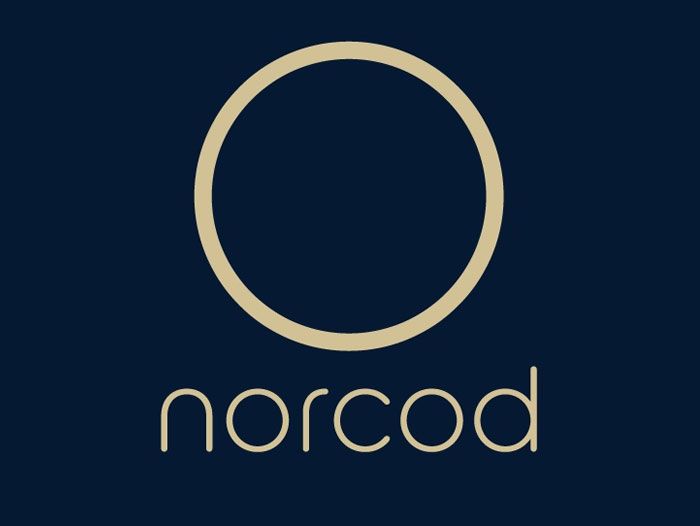
“The cornerstone of our new visual identity is a strong, clear, modern and elegant logo featuring a simple circular design element that we’ve dubbed the ‘Norcod circle’,” said company CEO Christian Riber. “It reflects not only who we are, but also what we do and the four core brand values we live by – Fresh, Transparent, Devoted and Quality. Simply put, our DNA.”
Symbolic element
The circle is symbolic of, firstly, fish schooling in ring formation representing Norcod’s Fresh promise (with rapid delivery in 48 hours to the UK and Northern Europe and 72 hours to Southern Europe and the US) and the important welfare aspect of happy, thriving fish. Secondly, it represents the large round fish pens deployed by Norcod, as well as its vision and promise as a modern company to be fully Transparent. Thirdly, it symbolizes the globe representing Norcod’s Devoted pursuit of sustainable production in the oceans. Lastly, it represents a round dinner plate symbolizing the Quality of Norcod’s premium product as a delicious meal.
“The circle also stands for the circular economy, in line with our ‘blue future’ goals to be the world’s first large-scale producer of high-quality Atlantic Cod that is respectfully farmed, carefully packed and delivered in a timely and efficient manner,” said Riber, noting that the first successful commercial farming of one of the world’s major groundfish species is ground-breaking in itself. “The novel branding reflects this spirit of innovation,” he said.
The company’s ultimate goal is for its fish to be known simply as ‘Norcod’ – a product title in its own right and reflecting an exclusive and unique brand.
“The world is hungry for fresh cod given increasing pressure on wild stocks and fishing quotas. Our new identity also signifies the valuable contribution we want to make by providing a healthy source of protein for the world’s growing population,” Riber said.
Colour palette
While the simple geometry of the Norcod circle is also mirrored in the logo typeface, the colour palette has also been selected very carefully. The two primary colours, ‘Deep Blue Sea’ and ‘Cod Golden’, symbolize the natural dark-blue aquatic environment of the sea as well as trust, dignity, intelligence, authority, reliability and strength.
Green production
Norcod is part of the shift to future food production that is much less taxing on the environment than many land-based protein sources. “We also have multiple initiatives to ensure green production, including battery-hybrid feed barges and service vessels, sustainable feed with high marine content, state-of-the-art equipment and a high focus on fish health and welfare,” said Riber.
He adds that the company will put a lot of effort into documenting the sustainable credentials of its product with valid data. “We are committed to environmentally friendly production and sustainability in every aspect of our operations and interactions,” Riber said.
Exotic origins
The new identity also highlights the Nordic origins of Norcod and the cold, pristine Norwegian waters in which it is farmed. This may not seem ‘exotic’ to people in Scandinavia, but is certainly perceived as exotic in many other countries.
New Nordic cuisine featuring the freshest ingredients has also become highly regarded globally in recent years. “The clean design of our logo reflects this trend, and I have no doubt fans of fine dining around the world will love Norcod,” said Riber.
Selected chefs, including Michelin-starred and renowned seafood chefs, have provided positive feedback on Norcod and its very firm flesh with no skin and meat damage thanks to careful handling and no use of trawl, nets or hooks. “It is a really nice-looking fish, with bright and firm meat, a healthy bone structure and a very nice, clean flavour,” one chef commented.
Strong selling points
“We are confident our new identity will help position the company as a dynamic new force in the aquaculture industry and the seafood market based on our unique value propositions,” said Riber. These include exceptional quality, 8% higher yield compared to wild-caught Cod, freshness, price and delivery stability, product consistency and out-of-season availability.
Looking ahead
The Norcod team has worked extremely hard throughout the establishment phase and Riber says they are looking forward to its first sales of fresh farmed Cod this summer. “When we start to generate income, we will continue to build the company and steadily increase our harvest volume in the coming years, according to plan,” he said.
About Norcod
Norcod AS’ core business is commercial sea farming of Cod but through ownership and partnerships is involved in the entire value chain. Norcod’s existing fish farms are located in Mid-Norway with ideal conditions for Cod. The company is contributing to blue ocean value creation with minimal impact on the environment while supporting local communities. Norcod is listed on the Oslo Stock Exchange’s Euronext Growth Market.
