Consistency Key To Effective Nutrition Labels
July 27, 2010 | 1 min to read

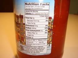
A new study has concluded that nutrition labels best attract attention if they are double-sized, monochrome, and appear in the same spot on food packaging.
The question of how best to communicate nutritional information on foods has been a matter of hot debate as new regulation on food information is currently being debated by the European law-making institutions. A number of issues have proved divisive, including where and how mandatory information should be displayed on a pack.
Svetlana Bialkova and Hans van Trijp, researchers from Waganingen University in The Netherlands was aware of evidence that only a minority of consumers use nutrition labels when shopping, which indicates a “bottle-neck” in information provision. For their study, accepted for publication in the Elsevier journal Food Quality and Preference, the researchers set out to investigate what attracts consumers’ attention to food labels.
They used the visual search paradigm to test a number of hypotheses on a group of 24 participants, all of whom had normal or corrected-to-normal vision and full colour vision.
To read the rest of the story, please go to: Food Navigator.
